
Pressed Paper Co. may earn a commission from select links in this article, at no additional cost to you
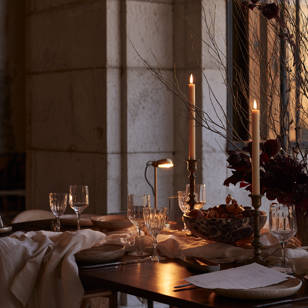
A beautifully arranged table begins shaping an evening before dinner is served.
It creates anticipation. It gives guests a sense of the mood they are stepping into and quietly communicates that thought has been given to their arrival.
But a memorable tablescape is not simply decoration.
It is composition: the relationship between material, color, light, texture, proportion, and the small details that make a gathering feel considered.
The goal is not a table that looks perfectly styled.
It is a table that makes people want to stay.
Before adding flowers, candles, or decorative objects, look at the materials already present.
Wood brings warmth and depth. Linen softens hard surfaces. Stone adds weight. Crystal catches light. Metal introduces polish.
The strongest tables often begin with only a few materials that complement one another rather than a collection of pieces chosen because they perfectly match.
A walnut table paired with ivory linen feels warm and grounded. Marble becomes softer beside handmade ceramics. Polished glass becomes more interesting when placed against something organic or imperfect.
This tension is what keeps a neutral table from becoming plain.
The principle: build the atmosphere first, then decorate.
European Linen Napkins in Sand — Quince
A relaxed European linen with enough texture to keep a neutral table from feeling overly formal.
Textured Linen Table Runner — Amazon
Look for washed European-flax or natural linen in oatmeal, flax, ivory, or warm taupe rather than bright white.
Beautiful tables give the eye somewhere to travel.
Think about contrast in both texture and finish:
When every element has the same finish or visual weight, a table can feel flat—even if each piece is beautiful on its own.
Contrast allows individual materials to become more noticeable.
A polished glass looks more delicate beside a roughly glazed ceramic. Silver feels especially luminous against matte linen. Handmade paper becomes more tactile when surrounded by hard surfaces.
The goal is not to add more.
It is to give each material something to respond to.
Calacatta Viola Marble Bowl — Amazon
A marble bowl with dramatic natural veining that adds weight and contrast to an otherwise restrained table.
Dorset White Wine Glasses — Williams Sonoma
Classic crystal stemware with a clean silhouette that adds polish and reflection without overwhelming the table.
Height is one of the easiest ways to make a table feel more dynamic.
Tall taper candles introduce vertical lines. Lower florals and serving pieces keep the center grounded. A small pedestal or footed bowl can create another level without adding visual clutter.
The eye naturally moves between these different heights, giving the table a sense of rhythm.
But height should never come at the expense of the people sitting around it.
Flowers should remain low enough—or airy enough—for guests to
see through them. Candles can rise above the sightline without creating a wall.
A tablescape should frame the conversation, not interrupt it.
There is a point in the evening when the table changes.
Daylight disappears, candles begin reflecting in the glassware, and suddenly materials that looked beautiful in daylight take on an entirely different character.
Lighting is part of the composition.
Instead of relying entirely on overhead light, introduce smaller pools of warmth throughout the table and surrounding room.
Taper candles provide height. Votives create a lower glow. A small cordless lamp can illuminate a darker corner of a long table.
Avoid heavily scented candles during dinner, where fragrance can compete with the food.
Ivory Unscented Taper Candles — Amazon
A simple consumable worth keeping on hand. Choose ivory rather than stark white for a softer glow.
Cordless Rechargeable Table Lamp — Amazon
A dimmable cordless lamp that creates a warm pool of light without relying on overhead lighting.
The most sophisticated tables rarely announce a literal theme.
Instead, they develop a color story.
Choose a restrained palette and allow those colors to reappear quietly throughout the composition.
A burgundy flower might echo the lettering on a menu. Warm brown linen may connect to the walnut beneath it. Pale green fruit can pick up the tone of nearby foliage.
These relationships do not need to be immediately obvious.
In fact, they are often more beautiful when they are not.
The repetition simply gives the eye small visual connections to discover.
A useful rule: when one element becomes expressive, allow something else to become quieter.
Patterned linens may call for simpler dinnerware. Sculptural flowers can sit beside understated glassware. Ornate silver becomes more compelling on an otherwise restrained table.
Restraint does not mean removing personality.
It gives personality somewhere to land.
Seasonality gives a table a sense of place and time.
Spring might introduce tender branches, bulbs, and fresh greens.
Summer lends itself to herbs, garden flowers, stone fruit, and tomatoes still on the vine.
Autumn can bring figs, pears, warm woods, and deeper colors.
Winter often feels strongest with evergreen, citrus, metal, and abundant candlelight.
But seasonal decorating does not require filling a table with symbols of the season.
Instead, notice what nature is already offering.
A bowl of pears.
A branch clipped from the garden.
Three persimmons placed beside a stack of plates.
A handful of figs on a stone serving dish.
Small references often feel more sophisticated than overt decoration because they make the season feel present rather than imposed.
Celia Ceramic Bowl — Williams Sonoma
A sculptural glazed bowl that can shift with the season—filled with citrus in winter, stone fruit in summer, pears in autumn, or branches and greenery in spring. Left empty, its form is strong enough to stand on its own.
The final layer is not necessarily the most expensive one.
It is the most human.
A handwritten place card.
A printed menu.
A flower tucked beside each plate.
A bottle opened because you know your guests love it.
A small favor chosen specifically for the people coming to dinner.
These details transform a table from something beautiful to look at into something that feels prepared for someone.
Paper is particularly powerful here because it bridges decoration and ritual.
A menu gives even a simple dinner a sense of occasion. A place card turns an ordinary chair into someone's place at the table. An invitation begins creating anticipation long before anyone arrives.
Pressed Paper Co. Place Card Template
Pressed Paper Co. Dinner Menu Template
A table should still be comfortable to sit around.
Leave space for glasses and serving dishes. Keep flowers low enough for conversation. Resist filling an empty area simply because it exists.
Negative space is part of the composition too.
And remember that the table is not supposed to remain perfect.
The best tables become slightly undone as the evening goes on.
Candles burn lower.
Glasses move from their original places.
Napkins unfold.
Serving dishes make their way around the table.
Someone reaches across for another piece of bread.
The carefully composed table begins to disappear beneath the evidence of the gathering itself.
That is the point.
A beautiful tablescape creates the setting.
The people around it create the memory.